Building a visual brand doesn’t have to be tricky or time-consuming.
Make it easy by following these 5 steps to branding bliss.
1. Find your own unique brand perspective
Forget trying to copy the design that’s working well for other brands. Keeping your design original and unique is the first way of gaining your audience’s attention. Their visual brand design may not even fit with what you are trying to convey to your customers.
Further, if you copy your competitor’s look and feel, you’ll appear not only untrustworthy and uncreative, you could end up with legal trouble.
The Graphics Creator can help you find your own visual identity through its numerous templates, all of which can be modified and reused. You can choose one look and feel and then modify it slightly for each blog post, advertisement, email, or web page.
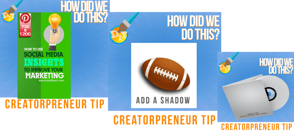
Moreover, you can save each version! See the simple example below? A different image was added each time using the same background design.
2. Speak to your target audience
Focusing on a niche helps you connect with your audience. You may be hoping that everyone everywhere will want your product, but you will only be stressing yourself out for little payback. If your audience doesn’t feel a connection, they won’t take a second glance at what you have to offer.
Determine the most likely group of people to need your product or service. Then show them you have their best interests in mind when offering to help. Not only will you feel good about being genuine, but you’ll also be the one they think of next time around.
Your visual brand should be built around this desire for an authentic connection. Let your brand’s personality speak to your audience.
3. Choose visual designs that appeal to your audience
With an eye on your target audience, you can create a visual brand based on what appeals to them. Each generation, sex, race, and age has different expectations about what they should get with their money.
Teens may pay attention to a trendy design, while someone in their 70’s may be more interested in a classic look and feel.
So, choose colors, fonts, and images that appeal to your target market. And just forget about using poor quality images just because they might be free or easy to come by.
If you can’t find the exact images you want in The Graphics Creator, you can import any image (or use The Graphics Creator to make your own image).
4. Be consistent with your visual content
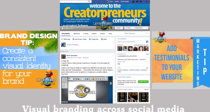
Now that you’ve got a brand design plan for your audience, keep it going throughout every visual you show to them: Email, website, blog, forum, social media, and advertising.
If you’re choosing different colors and fonts for each piece of marketing, your audience won’t recognize you. And they’ll have a hard time making that special connection.
5. Create an easily identifiable logo design
Although people often think of a logo design when considering their brand, there’s a reason this is listed as the last step. How can you devise a logo for your brand if you don’t know what your visual brand is?
Once you’ve mastered the top 4 visual branding steps, you can create a logo while maintaining consistency with colors, fonts, shapes, and images.
First, make sure the colors you use in your logo will pop out on any background in your marketing materials and website.
If your website background is blue, using blue as a primary color in your logo simply wouldn’t make sense. However, using a smaller splash of blue might nicely tie in your logo with your overall branding.
Try to keep your logo simple. Remember, this is a “mark” that will identify your brand: It must be easily seen and understood. Using too many colors, patterns or crazy fonts will diminish its impact.
Ready to create amazing visual content for your brand? Check out Laughingbird Software’s easy design tools.


