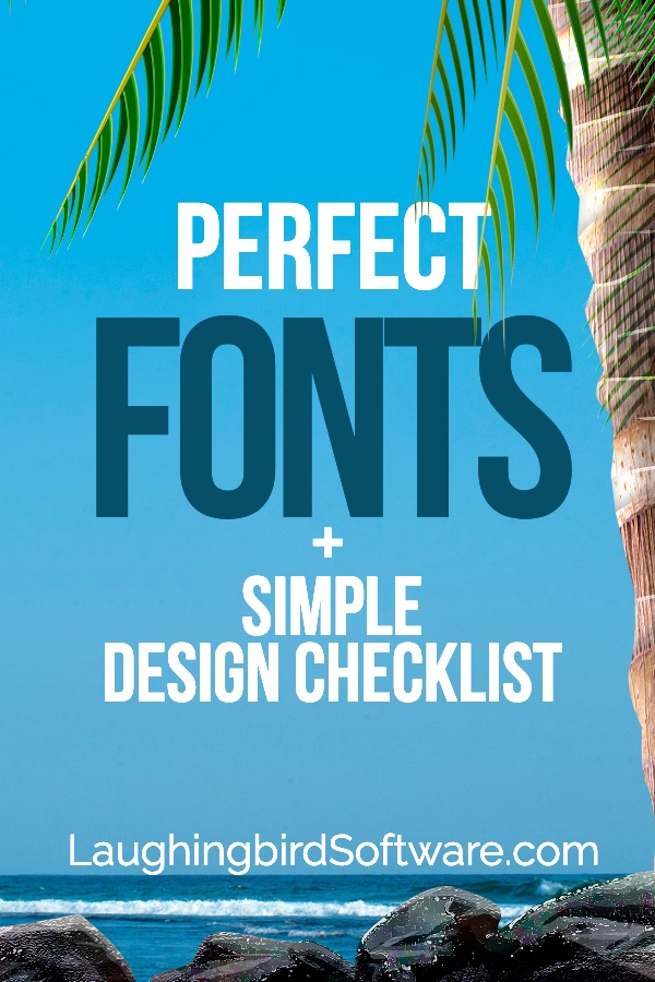
Using fonts effectively is essential to creating amazing graphics… and easy with Laughingbird Software’s design checklist.
If you’re not a designer (or even if you’re a beginning designer), then how you’ve been using fonts may not seem that important. Yet, ask yourself if you stop to look at every image that passes your gaze. Why do you pause to look closer at an advertisement, announcement or social media post?
Does the text on the design get your attention? Or just the image? Probably both! Well, guess what… the font used is not only part of the overall design but it’s also what is making those words pop out and grab you. And this is why using fonts correctly is so important!
Successful design depends on choosing the right fonts to get your target customer’s attention, as well as using those fonts accurately.
Even though there are tools that make design pretty easy, understanding the basics of font design will help you set goals for design in your business.
So, here’s a simple 3-point design checklist to help you use fonts in your business designs just as perfectly as any experienced designer:
- Can you easily read the text?
- Is the font congruent with the message of your design and the feelings it should evoke?
- Is it in the right position within your design?
Easy Font Design Checklist
1. Use a readable font
There’s really no science behind choosing the right font. Oftentimes, it’s trial and error. Try one font and then another until your design works.
But, seriously, no matter how many times you try a different font, being able to clearly read the message is even more important than the font itself.
Don’t make the mistake of using a fancy, unusual, or hand-written font if it isn’t right for your design. Start with a Serif font. These are easy to read and quite versatile. Then, if your message just isn’t coming across how you want, try a more interesting font.
Good: Using an Easy to Read Font

Bad: Changing the font to this typeface makes it difficult to read, especially if the graphic is small

Pair your fonts right:
Rarely is there a time when you only need one font. Even a logo design may consist of more than one font, either in the design itself or in the tagline.
To make an effective advertisement or social media post, you’ll need two-three fonts: One for the heading, one for the subheading, and one for the text.
So, don’t be afraid to use different fonts. What’s important is that the fonts look good together. To make this happen, you don’t want to use two very contradicting or two very similar fonts.
In other words, you want to see a difference between two fonts used in the same design… but not such a difference that the fonts clash.
And then there are the times that just one font can make a huge impact. Modifying the font using capitalization, thickness, outlines, shadows, and spacing could give it the exact look you need.
Watch the video to see how to use fonts to make stunning designs that’ll help you sell more:
Check out The Graphics Creator
2. How to use fonts effectively
Choose the right color for your font:
As mentioned earlier, being able to read your text is of number one importance in any design. And just throwing a nice font into your design doesn’t make it readable.
The basic rule of thumb when it comes to choosing the font color is this: Images that are dark should have lighter text while light images should have darker text.
The contrast between the light and the dark will help make it readable.
Good: Using a bright white font on a darker background makes it easy to read
Bad: Using dark colored fonts on a dark background does not let your text stand out
Adjust the size of the font and its spacing
Although it doesn’t sound important, adjusting the spacing throughout your text will unify the look of your font. Most often, you’ll want the spacing perfectly even.
Laughingbird Software’s tools make it easy to size and space your text using sliders.
How your customer will feel when you use a font
What emotion do you want your audience to feel when they see your design. Using fonts that elicit this desired feeling will only happen if you spend time understanding your customer first.
Once you understand who your target audience is, it’ll be easier to pick fonts that match this “feeling”.
Additionally, here are some ideas that’ll help…
If you’re trying to evoke feelings of femininity or beauty, using a script (or “hand-written”) font is a good bet. If you want a fun, silly feeling, you’ll probably go with a cartoony or kid-type font. And if you want to express strength or courage, you might use a big, bold font.
So, using the right text effect can create the feeling you want your customer to have.
Click below to easily create stunning designs using fonts and graphics:
3. Position your text correctly
The position of your text can alter the look and feel of your design… a lot! Therefore, decide ahead of time if you want the design to focus more on the image or more on the text?
First, consider placing the text somewhere that doesn’t block your image. This text can be vertical or horizontal, as long as it’s still readable. And don’t forget to adjust the font’s size and color.
Now, if you’d like more focus on the text, use a more subtle background (Laughingbird’s tools let you change the “opacity” of an image simply by sliding a button).
And certainly, consider placing the text evenly. You can center it, or perhaps justify it to the left or right. Just decide and treat all of it the same.
Good: Using a readable font that is correctly positioned makes your image more impactful.
Bad: Poor font placement: It’s hard to read (also, notice how the opacity of the background image is lower than the image above, making it even harder to read)
Great! Now let’s go back to the checklist and look at your design:
- Can you easily read the text?
- Is the font congruent with the message of your design and the feelings it should evoke?
- Is it in the right position within your design?
See, you don’t have to be a designer with a degree to create graphics! And using fonts correctly will help you make stunning graphics for your website and blog.
Begin creating designs with amazing fonts and images.
Fortunately, creating marketing & social media graphics, logos, banners, product designs, thumbnails, and more isn’t hard. Create what you need for your online business using Laughingbird’s design templates (with loads of fonts to choose from).
Great points! There is nothing that drives me NUTS more than trying to decipher text that’s difficult to read!
Yes, exactly! Like we don’t have enough to do already 🙂 Thanks Britt!
Great read – I’m a designer myself and I always stress the importance of font pairings and readability to my clients!
Thanks Halle. I’m glad you agree…Fonts make such a difference to a great design, don’t they?!