
You know you’re a beginning designer when you spend too much time moving around graphic elements but are still unhappy with your final image. And, if you’re an entrepreneur or small business tackling design while also running the rest of your business, it can seem a bit overwhelming.
But creating your own designs saves you a ton of money and gets you every image you need fast, exactly when you need it. Plus, it makes it a no brainer when you have access to an easy creation tool with pre-designed templates.
So take a few minutes to understand these six graphic design basics that’ll make it even easier to create the designs you need for your small business.
Then you can get more creative with your visual content designs for your marketing, blog, and website… without spending too much time working on a design only to decide that it doesn’t look good or send the message you want.
As an entrepreneur or small business, you’re probably a beginner when it comes to design. So, it’s best to start creating your images with pre-designed templates which are fast and easy. Templates will also help you apply the six design concepts listed in this article.
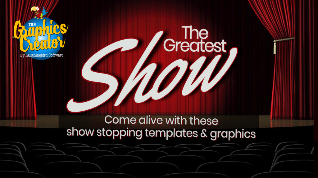
All of the image examples below are from The Greatest Show templates (For a limited time, if you get The Greatest Show Templates, it’ll come with The Graphics Creator software for free).
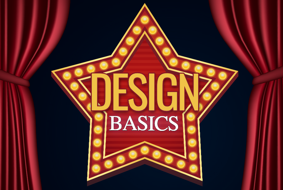
The Six Graphic Design Basics Every Small Business Needs to Know:
1. “White Space”
Space will make or break your design… really! “White space” (also called “negative space”) refers to all of the areas in your design only filled with the background. It doesn’t mean that your background is white, although it could be.
Instead, it’s more about keeping space around the graphic elements and text of your design in order to give it a clean look and make your message stand out.
You’ll notice whether a design is visually pleasing to the eye, even though you’re not a graphic designer. It’s super important to pay attention to this because it determines how your visual content is perceived by your audience.
Okay, so what’s actually wrong with putting lots of elements in your designs?
There are just too many visuals going on so your message doesn’t stand out to your audience. Let’s look at it this way. If your room is cluttered with boxes and tools, do you have a hard time finding your keys? Most likely, right?!
The same goes for design. So keep it simple by using just a few design elements placed in a manner in which there is a good deal of background space and your text, photo, or important graphic element stands out!
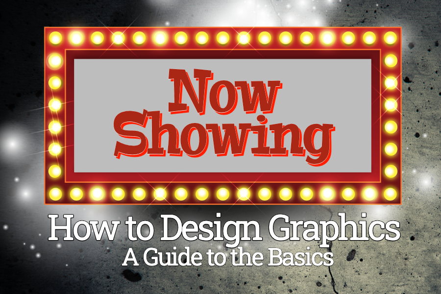
Check out the design below. It looks clean and professional. And it follows the graphic design basics we’re talking about in this article, including the use of white space.

2. Color
Color is extremely powerful. It can make you feel happy, sad, excited, or even stressed out! And this is still true when colors are used in design. A particular color can have a big impact on how your customers will be influenced.
For example, red can draw feelings of passion or power while a soft blue can actually decrease heart rate and have a calming effect.
Mastering the colors in your marketing design could make the difference between an okay design and a truly eye-catching one. As you become more experienced as a designer, you might even want to understand other color concepts such as hue, tone, and saturation.
For now, however, just focus on how a color might influence your audiences’ emotions.
Choosing the right color for your marketing graphics could make the difference between getting a sale or having a potential customer leave your site empty-handed.
Here’s an example:
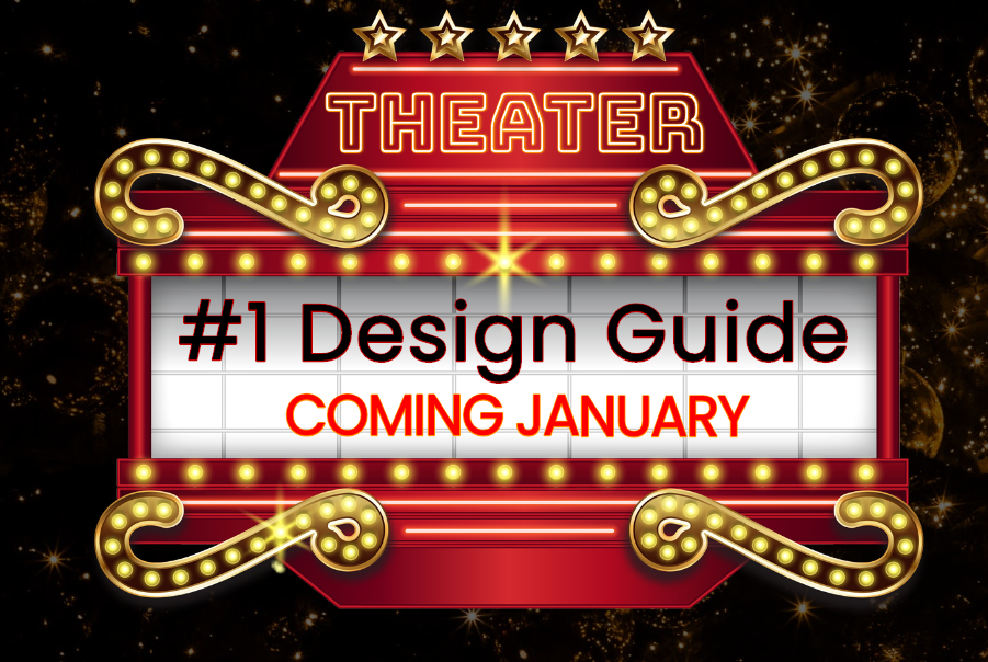
The color red is powerful, attention-getting, and calls to your audience to take action. Check out this image in which red is used in different forms to create an impact:
3. Value
“Value” represents how dark or light a design is. It sets the mood of the design. When considering the audience who’ll be viewing your design, you’ll want to determine whether a lighter or darker design is best.
You can include the same basic elements in a design (your logo, objects, text) yet create a very different feeling based on the light or dark colors you use.
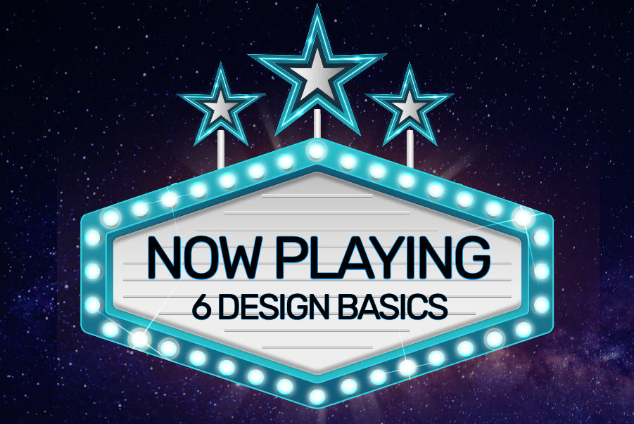
Check out the red and blue graphic examples above. The blue design has a much brighter and relaxed mood.
4. Lines
First, notice how lines can play a role in design. They’re most often used to separate different sections of a design and to give the viewer a focal point.
Lines can be long, short, thick, thin, straight, curved, dashed, textured, or any color. They create different visual effects and, therefore, give a unique visual impact, depending on how they’re used.
For example, a thin, blue line can elicit a feeling of calm and unity. However, a thick, black line, will draw attention in a powerful way.
Color and Value (from above) also play a significant role here. Whereas darker lines may be easier to see and grab more attention, lighter lines may bring a more minimalistic or subtle feel to the design.
This is why lines, as simple as they seem, are still one of the most important graphic design basics.
Take a look at how multiple, bold lines around text can draw in your audience.
5. Shapes
Every design uses at least one “shape”. The shape, or “form” of a design helps it to stand out. You can use squares, rectangles, circles, triangles, or any abstract shape.
Shapes can be used somewhat like lines. They’re both associated with different movements and flow. Therefore, shapes are a basic necessity of a design that improves an image’s uniqueness. So, while squares are often seen as very structured, circles are associated with movement and continuation. Using these elements, therefore, can actually change a viewer’s perception.
And, as an online entrepreneur, you need to present your product or service in a way that holds your audience’s attention. Therefore, using the shape in your design that makes the statement you want is important to your business.
Take a look at how this unique shape (as well as the bright color and solid lines) invite your audience to find out more about your offer.
6. Textures
Textures are wonderful, easy ways of making a graphic unique! You can use a textured background in place of a single-colored background to give the design a totally different visual impact. It can also be used within the text for an unusual look and feel.
A texture can be subtle, where a viewer would have to look closely to see that there’s a pattern. Or, it can be blatantly obvious, having a more powerful visual impact.
There are many styles of textures. These include wood, brick, concrete, paper, stone, fabric, or natural elements, such as grass, bark, or water. If used sparingly, they’ll be subtle. But if used liberally, the texture can be quite pronounced.
If you’re an entrepreneur who doesn’t have a lot of experience with design, you may not realize the impact that using textures can have on your designs. So, spend some time playing around with textures using the same objects or elements to see the amazing differences.
Here are a few other ideas that’ll complement the previous six design basics and help you bring order to your design.
A Few Other Graphic Design Concepts
Being a small business entrepreneur, it’s understandable that going beyond learning the basics of graphic design is not something you want to spend a lot of time on. However, you also wouldn’t wear one shoe that’s higher than the other and feel off-balance with each step, right?
So, these last few design concepts are worth considering and won’t take up a lot of space in your probably overcrowded mind.
Balance, Alignment, and Proximity
To balance your design, you’ll need to distribute the elements evenly in order for it to look like a professional has created your design.
“Balance” can be symmetrical (where elements are spaced evenly on both sides of the design) or asymmetrical (in which elements are contrasting in order to give it an even flow… dark elements balanced by light ones).
Alignment and proximity will ensure that you’re placing your elements in an ordered fashion. You’ll want them to look good together because they’re grouped based on relationship. This will keep it from looking cluttered.
One way of doing this is to group related elements together. Another way is to connect elements by color, font, or size.
Conclusion
Alrighty, are your creative juices flowing? You can now create your own stunning images with these 6 graphic design basics that any small business or entrepreneur can follow.
Now it’s time to put what you’ve learned into action.
Create your next design with the easy-to-use templates and designs you’ve seen here in The Graphics Creator’s Greatest Show templates. And, you can use all of the design concepts you’ve just learned, even if you’re a small business and not a designer.

How do you get CMYK in Graphics Creator (for printing)
Hey BJ! What are you wanting to print? 🙂
Always good to refresh these things as I get so focused on other things. Thanks Lisa!
Hi Glo!
You’re welcome! Yes, following these design basics make using The Graphics Creator even easier because you know exactly what to focus on and don’t waste any time 🙂
Much appreciated, I’m beginner and older too (76) and the memory is not any good i have teflon in my mind, it’s different as Photoshop has a lot of tools im retired today and i tried to learn some editing tips to experiment in photos some publicity for small busines.
Glad to help Manuel! Yes, Photoshop can be tricky for sure. Plus, who has time for all that?! I love that The
Graphics Creator can do all sorts of little tricks that make your designs professional-looking (but without the stress!). Enjoy!
Thanks L!
You’re very welcome Terry!
I have never made so many great images since I started with Laughingbird Software.
But why I really like Laughingbird is because Marc and Lisa Sylvester are good at following up with great ideas to use it
Thanks RT! That’s really nice to hear. Marc and I always strive to give you what you need 🙂
I really appreciate this wonderful post that you have provided for us. I assure this would be beneficial for most of the people.
Thanks so much!
Great tips thank you always good to get some guidance.Thanks.
Happy to help guide you Colin 🙂
Great information Lisa… I’m always delighted to learn more from you and Marc! Thank you for sharing your expertise!
Awwww, thank you Gail. Glad this was helpful! We’ll be sharing an article every week 🙂
Awesome tips Lisa. I always get value from Laughingbird.
Thanks Tom! You are very kind and that’s wonderful to hear 🙂
Hi Lisa.
Thanks for these design tips. Much appreciated.
You are very welcome John. Glad they were helpful to you 🙂
Thanks for this information
You’re very welcome Olivia 🙂