What a bummer… that you can’t just put up a website, make sales and forget about it. Sorry, that would just be asking for multiple website design mistakes to happen! And big mistakes mean that people won’t stick around for long on your site.
Don’t let this happen to you!
Read these ten website design mistakes you can’t afford to make:

1. Broken Links
Links that lead nowhere… they also lead your sales absolutely nowhere. Are you going to stick around a site that doesn’t give you the information you need, not to mention wastes your time? Me neither.
Test your links frequently. Fix broken ones right away!
2. Slow-Loading Site
If your website doesn’t load quickly (I mean like in a few seconds!), time is again being wasted and people will leave. Yep, you somehow got them to your site…. and now, bam, they’re gone.
Often, this is due to graphics that are too big or special features like an animated introduction. Reduce the size of your graphics and consider whether you really need those fancy add-ons.
3. Bad Navigation
How many times have you been to a home improvement store and can’t find what you need? Have you left in frustration, thinking you have better things to do with your time?
This really works just the same on the web. Don’t make people hunt for what they need. Make sure your navigation bar is on every page of your site, so people can get to where they need, on any page, from any page. Highlight important links and make sure those links are well-organized under the appropriate heading.
4. Too Many Words and Actions on Your Website
You might not think this is a typical website design mistake. Afterall, you need to let the customer know what you’re all about and what’s going on.
However, potential customers want to know what you have to offer immediately upon entering your site. Too many words or overloaded information, graphics or otherwise, can turn them off.
Use those well-organized navigation links, as discussed above, to let people browse your site on their own time.
5. Too Many Different Fonts
Yes, fonts are fun. But only if you’re the one using them. Fonts can actually destroy your site if there are too many or they’re too funky. Don’t use more than one “fun” font, and then only if it really jives with your brand.
There is never a need for more than two to three fonts on a page. Your audience needs simplicity and assurance of your professionalism.
6. Too Many Colors
Like fonts, colors are great fun but can be way overdone. Again, use only two to three colors. Make sure they work together to make your website experience not only pleasant but an expression of your brand.
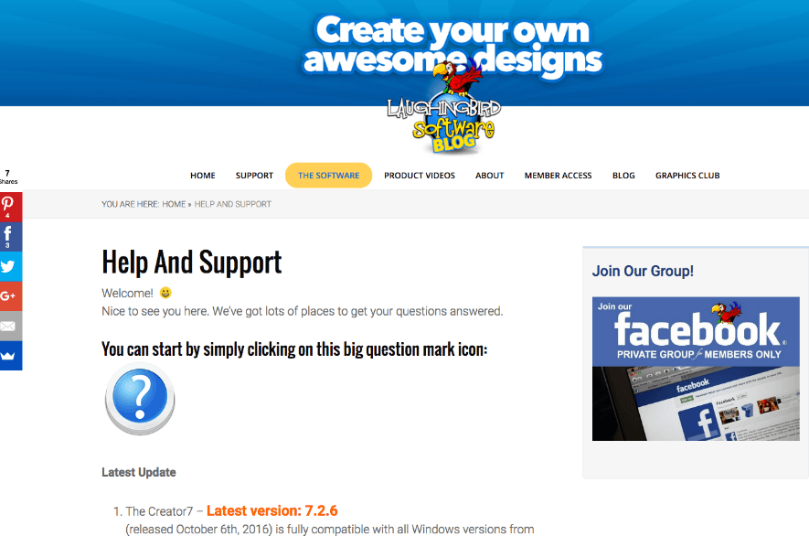
7. No Way to Make Contact
Customers need to see a “Contact” or “Support” link immediately. If your website has this readily available, you’ll be seen as trustworthy. Customers will know that you are available if they have questions, which provides a great deal of comfort.
In the image below, you’ll see an example of good web design. A clean navigation bar across the top, simple and clean design, no more than 3 colors or fonts and easy access to customer “Support”.
8. Not Using a Logo
What?! No logo? A logo is the number one identifier of your site and brand. Not only should there be a logo on your website, you should be using the same logo on your blog, marketing material and social media.
Customers should come to recognize and love your logo because it gives them what they need and helps make their lives easier. Use your logo design everywhere!!!
9. No Video
Yes, many online businesses sell products and services without using video. But it’s still a huge mistake. A video can easily sell your product or service in just a few minutes, without any need for site navigation at all.
With a video, you can let your audience know how a product or service will solve their problem or fulfill their need. Video does require knowledge to create or some loose change to pay a professional. Still, it’s worth considering.
10. Icky Marketing Tactics
Here’s the biggest website design mistake ever! Icky marketing tactics! Repeated pop-up windows is the most used offender, as well as saying “only one left” or “must get it before the timer counts down”.
Gag! People have gotten wise to these tactics and they just reek of a scammy website. This doesn’t mean that carefully using a pop-up window is bad. Just use it respectfully and allow people to easily get past it if not interested. And, please, no more than one!
So, you’ve learned about 10 big website design mistakes! Focus on correcting these errors and you’ll be on your way to keeping visitors on your site (and increasing your sales!).
Learn more about website design from our recent article on Must-Have Website Graphics.
Download The Free Version of The Graphics Creator right now.