Your brand’s logo is the number one graphic identifying your small business. It’s the mark that everyone should recognize.
And, with advanced planning and understanding of logo variations, your logo will be ready to go at a moment’s notice. You’ll simply drop it into any image, social media, website, or business card.
Continue reading and you’ll find out the types of logo variations you need for your small business. And then you’ll discover how to make them with easy-to-use graphic design software and logo templates.
What Are Logo Variations and Why Do You Need Them?
Basically, a logo variation refers to a different version of your primary logo. Each variation may be arranged in a different format or share slightly less information than your first logo.
For instance, your primary logo will be what you use when it fits perfectly in the space you need it to go into to. However, you’ll need to use a logo variation when there’s no room for those same dimensions.

5 Logo Variations You Need
Three to five logo variations are common to have for professionally designed brands. You will always have your primary logo, secondary logo, and then one to three complimentary variations for different uses.
After you check them out, make sure to take a look at the examples that follow.
Here Are the Different Logo Versions You Need and Why You Need Them:
Primary Logo
This logo goes on page headers, training guides, virtual book covers, or other large brand deliverables. You’ll use your primary logo anywhere and everywhere you possibly can, when it fits in the space given.
This variation has the most details and conveys the full meaning of your company.
Therefore, it’ll most likely include your brand name, a tagline, a defining image or graphic element, and possibly other small design elements. If you’re not just an online business, it might even include your location or “established” date.
Secondary Logo
You’ll use this on things like business cards and invoices. This is a scaled-back version of your primary logo, with modified elements and some details removed.
Your business name might even shift positions so that you can fit it in a narrower or smaller space.
Submark Logo
Also called Brandmark or Icon, this is a smaller “mark” that is recognizable as your brand and can be used on social media, profile images/avatars, web page footers, and stickers. It can also be used for a favicon (your identifying image on your browser) or anywhere that provides limited space.
In fact, you’ll probably find yourself using this one the most. Even though it’s used in much smaller places, like your Facebook profile, it’ll still be recognizable as your brand. And your visitors and customers alike will know who they are engaging with.
Variation of Your Primary Logo
Other uses of your logo might require a small change so that it’s visible on a certain background.
This would most likely include any small text or tagline. For instance, on a dark background, your black tagline won’t be easily visible, so you’ll want to have a logo variation with a white tagline as well.
I often use this type of variation for our brand logo on Pinterest pins since I use a lot of different colored backgrounds for each graphic.
Variation of Any Secondary Logos
This is the same idea as your primary logo variation, but you will only want to make a very subtle change, and only if needed. It’s often helpful to have an outline on your logo so that it fits on any background.
How To Create Your Primary Logo
First, you may wish to understand the basics of designing a logo before creating your own.
What Are the Important Characteristics of a Logo?
Then you’ll also want to determine the best colors, fonts, and types of logo for your small business. You can check out this company logo design guide for help.
Watch this video to get a step by step walk-through of creating a logo with the Logo Creator and Business card templates.
What Does a Primary Logo Look Like?
A primary logo will be detailed and fully colored. It shouldn’t be overcrowded or confusing but should be clear and to the point.
This doesn’t mean that you can only use simple text and lines. Rather, you want you logo to look different than all the other simple ones out there. So, don’t shy away from color and objects… just use them carefully.
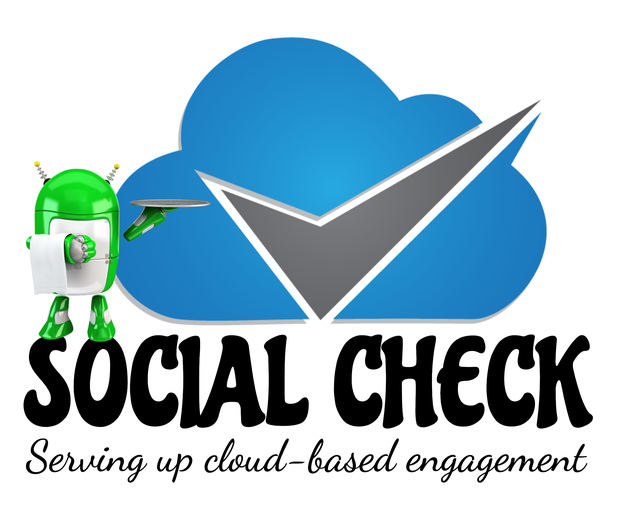
Here’s an example of a primary logo created with The Graphics Creator template-based design tool.
You can choose to add color and interest to your logo, such as with this little green robot that adds visual interest. But, you might also rather leave out the robot if your brand conveys a more serious tone.

Either way, your primary logo should include the company name, tagline, main logo image, and side graphic (which is optional). It might also contain the dates of establishment, if it makes sense for your brand.
You should love your primary logo and want to splash it all over the internet and print materials.
And, even though you love it, it just won’t work in every situation because of its size or detail. So, this is where your logo variations come in.
How to Make Variations of Your Primary Logo
Now that you’ve created your primary logo using the colors, fonts, images, and graphics that represent your company, it’s time to make each variation.
Having each variation on hand makes marketing and posting on social media fast and easy. You always have what you need!
Secondary Logo Creation
For your secondary logo, decide which elements of your primary logo you can remove and still have an attention-grabbing logo.
From the above logo example, I’ve removed the side character graphic. This little robot won’t show up well on an invoice and will make a business card design too cluttered.

Secondary Logo Variation
Create Your Submark Logo
Your submark (or brandmark) logo will be used as a smaller representation of your brand. It should still communicate your brand’s meaning… it’ll just be smaller. However, you’ll still want it to be easily recognized.
Just because it’s smaller doesn’t mean it’s less important. In fact, you’ll use this all of the time in social media, profile images and more.

Example #1 of a submark logo


How to Design a Simple Favicon
Favicons will be viewed as very tiny, so they really have to be simple. So, they’re either going to only include initials or a very small logo object.
Simply remove all of the design elements in previous versions and keep the same font (or object) as used in your primary and secondary logos.

How to Make Variations of Primary and Secondary Logos
Finally, as you saw with the issue of the white outline on the submark above, there are reasons you might still need other variations of your brand logo.
Here are some changes you might need to make:
- Change the outline color so it shows on different colored backgrounds
- Change the text color so it shows on different colored backgrounds
- Make your brand image or graphic smaller
- Rearrange the text to make your logo narrower
- Add a background color to your logo, so it’s not transparent
Create Your Logo Variations Now
Download your Logo Creator templates (and business cards!). Now you’re ready to create stunning logo variations that best represent your brand.
Open the Logo templates and drag and drop elements and text. You can even import your perfect image for any logo.
And you can make logos, logo variations, and business cards to sell to your own clients.
Very helpful! Keep it up.
Thanks Bill. I appreciate it 🙂
Really helpful, thanks
Thanks so much Trish… I’m so happy it was helpful 🙂
I enjoyed reading about this variations. I really haven’t thought about it much until now. Good advice. Thanks!
Glad it was helpful James! It’s really helpful to create all the variations of your logo and just plop them in any design or media. You won’t have to continuously rethink it. Just keep all your variations in one folder so they’re easy to find 🙂